


1
2
3
4
5
6
7
8
9
10
11
12
13
Authentication at Chase
My current work at Chase focuses on security and authentication. I work more closely with our cybersecurity team to communicate highly-technical errors and scenarios to our users.
This is our public-facing sign-in screen on chase.com.
For Your Protection
“Unrecognized device” flows at sign-in are a huge pain point in the user experience. Users are trying to login to do something, and it’s not to verify an unrecognized device.
The messaging should be upfront and clear—I want the user to know why their experience is being interrupted and that it can quickly be resolved.
Get Verified
The title of this flow, “For Your Protection” is a reminder to the user that we’re doing this for their benefit/the security of their accounts. “Get verified” alongside the progress bar tells the user that this isn’t a passive flow—they’re an active participant in their own security.
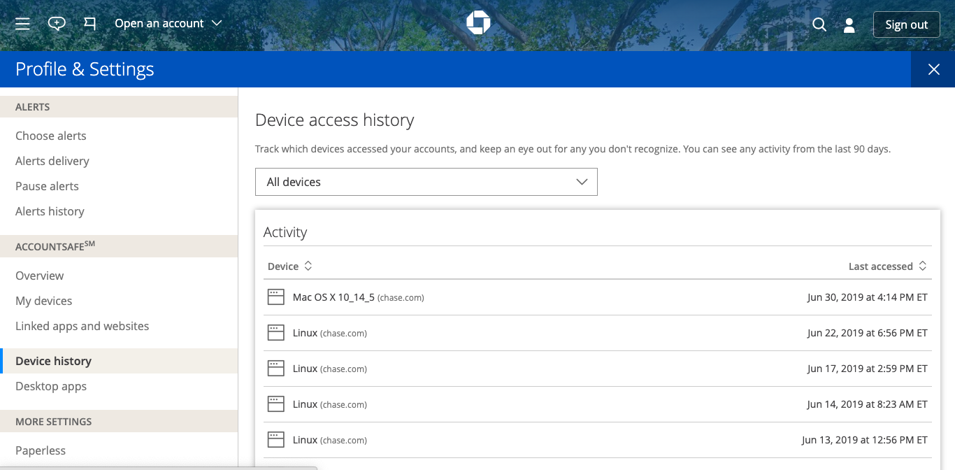
Secure Home Page
Once the user successfully signs in, they can click on the person icon in the upper-right hand corner and access more security features—I’ve worked on alerts management, AccountSafe, and authorized devices.
Alerts Management
A conversational entry point to a feature that requires a “set it and forget it” mindset.
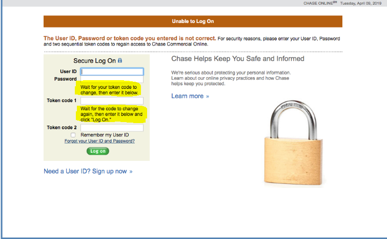
RSA Token UX—Before
This is a page from the “Chase Classic” site—the content for this page in particular was for a business user who unsuccessfully tried to sign in with a series of security codes.
When chase.com and all of its properties moved over to the new layout, this was a scenario that was left behind and discovered as a defect.
RSA Token UX—After
The new RSA token error sign-in screen—we discovered in QA that I wouldn’t be able to add a line break between the first two sentences, but the page looks and sounds much better than its previous iteration.